As part of a recent paper (figure 2) I was tasked with plotting the distribution of some muscle properties. Traditionally this would be done with a box-plot. Box-plots are useful for presenting aggregate information (central tendency, spread) about some data, but in doing so they conceal the details.
An alternative to box-plots are raster plots. In a raster plot each observation is plotted with a single marker. This allows people to see your data unfiltered, but at the expense of not presenting any aggregate information.
Since we wanted to present both aggregate information and the raw data, we cut the right hand side off of a box-plot and ran a raster plot down that side. I had a request for the source code for this plot. Of course anyone who wants that code is welcome to it, but in the interest of clarity I decided to partition off the code needed to make the plots themselves, give it a quick clean and re-factor, and offer it up to anyone who might want it without the muscle physiology baggage.
So I present hybridrasterbp, a python package which uses matplotlib, numpy and scipy to create plots like those in the paper. As an added bonus I've thrown in the ability to add a kernel density plot like those used in another paper (Figure 2) I'm an author on. I generally prefer kernel density plots to box-plots myself, but they can be particularly useful if you have so much data that raster plots become unwieldy.
One important thing to note is that you wont get figures that are as pretty as those in the paper unless you have someone available who can do the kind of post-processing work my colleague and co-author Tatjana Hubel did with this figure.
Much appreciate goes to the RVC for allowing me to release this code to you under the GPLv3.

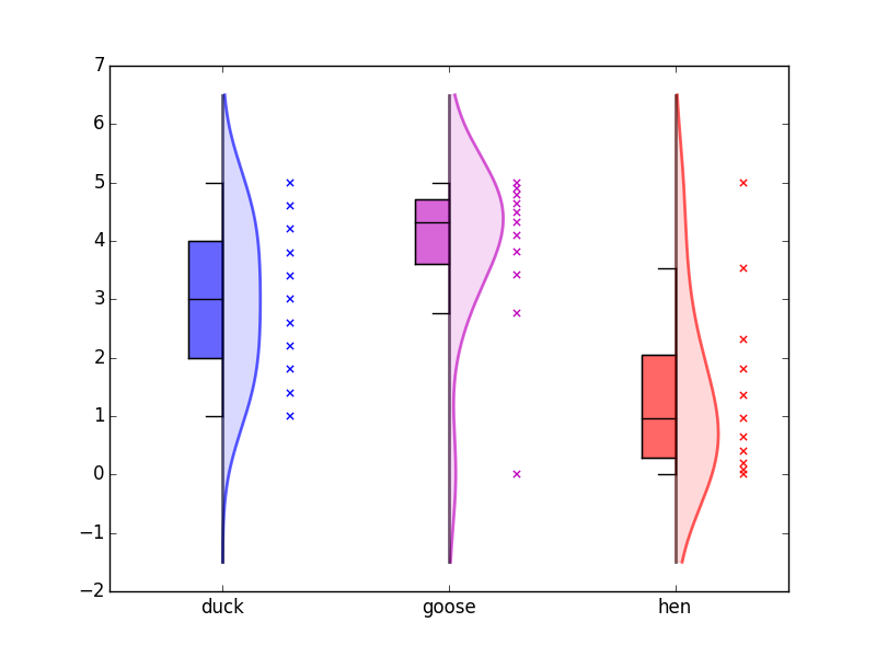
Example plots from hybridrasterbp, the top illustrates using only the boxplot and raster options, while the bottom includes a kernel density estimate.